Currently showing in the NLG: Senior Studio 2015

Come see the works of 19 seniors from their two-term intensive studio art class. The vibrant exhibit in the Nancy Lincoln Gallery features an array of mediums and captures the spirit of these young adults. You can watch a bit of their process here.

ARTISTS

Samuel Bacherman
Nadia Bednarczuk
John Caruso
Claire Chan
Mackenzie Donahue
Rachel Feldman
Valerie Fisher
Anna Fubini
Stephen Gousby,
Henry Hirshland
Jamie Kennedy
Charlee Manigat
Gabriela Marks
Anne Markstein
Samuel Radin
Daniel Sheets
Lina Sullivan
Alexander Volcy
Chloe Winston

MORE ABOUT SENIOR STUDIO
Sejal Patel, one of the teachers of Senior Studio, writes:

While Mr. Ingenthron and I taught the class, this class reflects the skills, expertise, and involvement of all the teachers in the Beaver Visual Arts department. For nine students in this Senior Studio class, their visual arts journey began in Ms. Winston’s Middle School art class.

As a whole, students in Senior Studio arrive with varied skills, ideas, and exposures in art. One unique thing about Senior Studio students is the confidence and the excitement with which they express their ideas and opinions about the art they see in the world and want to make. Most often their responses, reactions, and questions to the art they see and understand are not always expressed verbally but instead are subtly woven into their personal process and work in the class.

As they will tell you, their process of making art is not alway so straightforward. The most challenging part about art making is coming up with the idea and a lot of times students will begin by first identifying the materials they are drawn to or are curious about. After that begins the experimentation and visual realization of their final piece, which in this class started with a mini prototype. Of course its easy for me to say this in one sentence but it is certainly not that simple. It is many days of thinking, researching, experimenting, doubting, and working hard to finish something they are not sure can be ever “finished”. The transformation of their process, skills, and attitudes throughout the term is something that is not so clearly evident in their final product – and this is something they will remember and take away with them.

For the teachers, their final polished pieces as they now hang in the gallery are a reminder of their growth, dedication, and individual stories of success in the classroom. It was wonderful to see the very crowded gallery celebration at the opening reception, full of proud relieved faces who enthusiastically greeted friends, family, and community members.

If I had to summarize this group’s style in few words, I would say they are “cool, funky, and bold.” The vibrant colors, intertwined patterns, animals, pop culture, edgy rough materials and quiet hidden messages all providing an enveloping experience as we stand in front of it.

You might ask, now that the show is up, what happens now? In the next few days, the class as a whole will go in this gallery and sit with their pieces to self reflect on their process and individually pose for their artist portraits next to their pieces. Most importantly they will write a letter to the future Senior Studio students. This has been a tradition for many years. In the letter they will leave each new student with an individual art challenge project for their first week of class – much like their first week in Senior Studio.

Congratulations Class of 2015!

SNEAK PEAK
Here is just a small collection of the works featured in the show. Check out #seniorstudio15 on Instagram to see more images from the shows. We’ll be updating it daily!
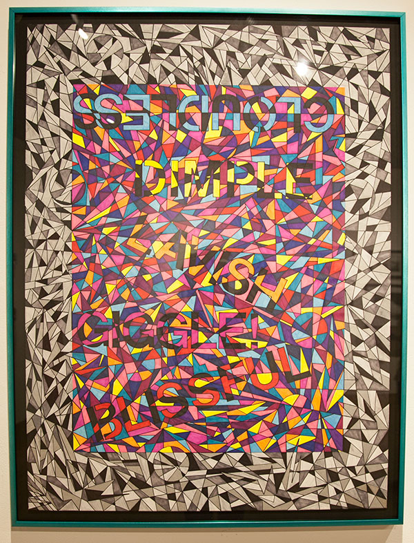
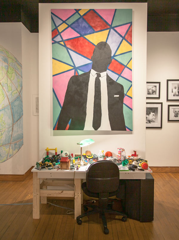
Neon Vibes by Gabriela Marks Like Kanye Loves Kanye by Henry Hirshland
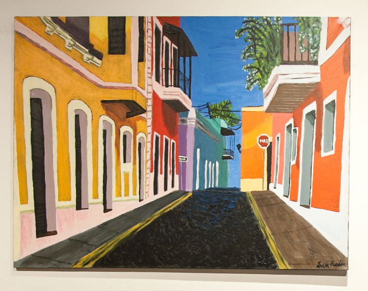
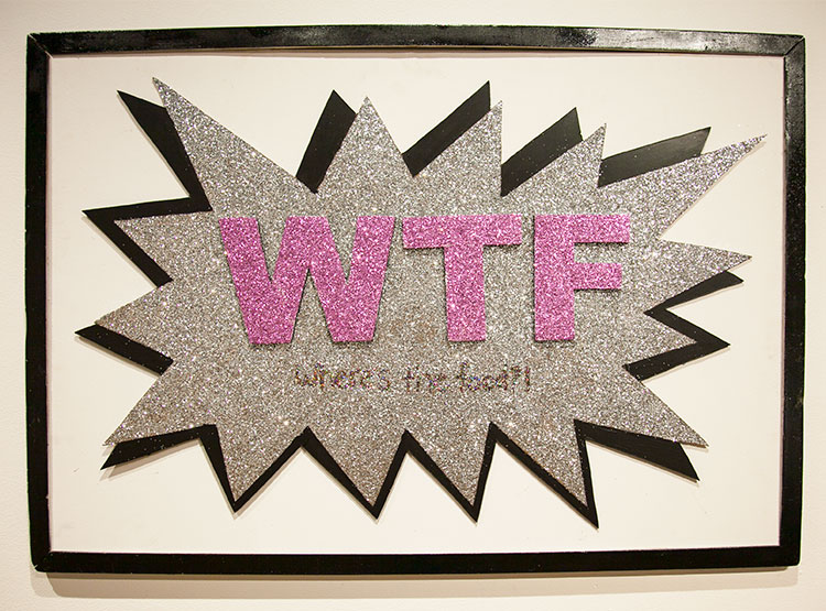
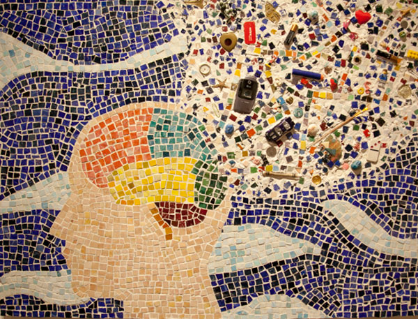
Sam Radin Where's the Food by Charlee Manigat Mind Blown by Annie Markstein
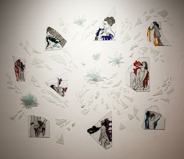
Transparency by Anna Fubini John Caruso

59 thoughts on “Currently showing in the NLG: Senior Studio 2015

  1. Glory vs Transparency
    The piece “Glory” by Sam Bacherman is much more literal than Anna Fubini’s piece “Transparency”. Sam’s focuses on his favorite soccer team. He made a shield with a combination of the teams old and new logo. While I appreciate Sam’s craftsmanship, it doesn’t have as much interesting underlying meaning that draws you in, like Anna’s does. Anna’s piece is interesting to look at and it has something below the surface as well.

  2. Like Kanye loves Kanye vs. Glory
    The piece “Like Kanye loves Kanye by Henry Hirshland is a very abstract and vibrant compared to Sam Bacherman’s piece called “Glory.” While Sam Bacherman’s piece is put together by his favorite soccer teams logos, Hirsland’s geometric styled piece is about Kanye West. Both are very intriguing, compelling projects; one day I hope that I can get into senior studio and create something like this.

  3. Why did you name it quiet even thought there where many loud colors and lines? (Lina Anderson)

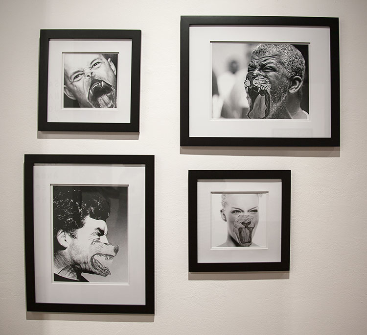
  4. I really enjoyed looking at Rachel Feldman’s cobra. I would like to know how many washers she used and how thought of the idea of a cobra made from washers. I also enjoyed John Caruso’s pictures of people with animal faces. They have very different processes and style. They both use animals but in very different ways. Johns piece mixes human emotion and animal emotion while Rachel creates a cool factor of a cobra with red LED’s. I can understand some meaning with Johns piece, while I have questions about Rachel’s cobra.

    1. Hi Aram! I used about 2200 washers overall and they are fused together with a metal glue called Epoxy. I decided to use metal as my material since I have never used it before and I’ve always been fascinated with metal sculptures, especially the ones made of scrap metal, so I decided to make my own using washers. Do you have any other questions about my piece? I wrote a more in depth description of my thought process in my artist statement in the gallery packets if you want to know more.

  5. I really liked Claire Chan’s piece. I think that it was interesting that something as simple as doodles, could spark such a big idea. I liked that there was so much meaning in the piece. Also, I liked how she took many different ideas and combined them into one. Another piece that caught my eye was called Headfirst, by Valerie Fisher. I liked how she took things from her surrounding and incorporated them into her piece. Both of the artists had similar process. They both had a hard time starting out, but were able to cram a lot of meaning into their final pieces.

    Questions:

    If you could change one thing about your piece, what would you change?

    Are you happy with your piece?

    What do you think makes a art piece good?

  6. To: Sam Radin

    Which painting of the three took the longest to make? Which was the most enjoyable to make if there is one?

  7. Claire Chan’s piece:
    The stark contrast between the different textures provide aesthetic appeal, but I’d like to know more about each part. What does the barbed wire represent, and why does it show up often? What do the mainly black sections mean, and why are there so few, compared to the gray or white ones? There’s a lot going in the piece, and it poses a lot of questions to the viewer.

    Lina Sullivan’s piece:
    I like how the different parts of stripes are right next to each other and don’t blend with each other at all. It makes you think of what the artist was trying the relay onto the audience. Claire’s drawing was similar, but the sections combined together differently and the lack of color gave it a much different feel. Overall, however, they are fairly different to each other. Why are some of the chair’s and table’s legs left blank? What was the goal of this piece? Are the colors chosen for a specific reason?

  8. I really liked Claire Chan’s Chaos. I liked it because it seemed very natural and authentic. I liked how one’s perspective can change based on the perspective that the viewer views the painting. When I first saw the canvas, I saw it as many different segments, none of which related. However, when I really explored the painting, I saw the hidden meaning that connected all the doodles. I believe the real message from Chaos is that the world is always fluctuating, and that the world is not black nor white and rather is grey, hence why she chose to draw it in pencil. I will compare Chan’s Chaos to Henry Hirshland’s Like Kanye Loves Kanye. Unlike Chaos, this one was more simplistic on the outside. Yet, when I read Henry’s description, I was able to see what he was trying to evoke. I understood how the addition of colors represented many different views on life. Although they may not appear the same at first glance, Henry Hirshland’s Like Kanye Loves Kanye and Clair Chan’s Chaos are all but different.

    Question to Claire: At what point in your creative process did you find ways to connect each individual doodle together into one big piece.

  9. The Music Exhibit by Stephen Gousby and Alex Volcy, and Like Kanye Loves Kanye by Henry Hirshland are wonderful pieces that intertwine with music and pop culture; However, Henry Hirshland’s meaningful message that rests behind his piece goes deeper into the midst of reality. As Henry said in his Artist Statement, Kanye’s Graduation album, designed by Takashi Murakami, has a color-way that represents his student life, which is directly related to Hirshland. The way he mixed the colors from the actual album into his piece of work is insanely creative, for it was meant to “evoke ideas about the role school plays in students’ lives compared to the role that it is intended to have in society,” says Hirshland. After viewing Hirshland’s piece and connecting his idea to his work, I am left with questions about Volcy’s and Gousby’s piece, primarily about what their, I guess, motive behind their works, other than being interested in the music industry and those artists. How were they trying to connect their works to the society we live in today? All in all, these works were truly creative, extraordinary, and meaningful.

  10. My question is for Sam Radin and it is on your third piece of the two girls. Why did you choose to paint this one specifically? How were women portrayed in art through your research? Who are the two girls that you chose to paint? Where are they supposed to be? Thanks for your time. I really enjoy all your paintings and I think they are really really good.

  11. I really loved the the three painting piece mostly because of its pure beauty. After reading the artist statement for this set of paintings i wondered if these came from imagination from memory or from pictures? (especially “old town”

    1. I only do art that I am passionate about and that I know I wouldn’t get bored doing everyday for an entire semester or two. And since I love food, I had to relate my art project to food in some way to make myself more excited about my art piece! 🙂 <3 xoxo

  12. I wanted to ask a question about Headfirst by Val Fisher. When Mr. Ingenthron gave you the piece of paper to paint on, were any of the paintings inspired by foxes at all? Or did you get the idea for painting foxes much later?

  13. I noticed in the piece “Quiet” by Lina Sullivan everything was covered in pattern except for the flowers. Why did you not put pattern on the flowers? What is the significance of the flowers?

  14. The questions that I have:

    How did the ideas come to each artist? or what started with?
    A question for “Eternity”. The project looks so prefessionally made and i like how it has other components to it than just a flat surface. My question is that how was it that you created this elaborate plan for a scorpion.

    1. Hi Bill, as I talked in my artist statement, I really like snakes and I wanted to create a project out of metal. When I combined these ideas the final product was clear; a life sized metal snake. I really like to imagine projects in my mind and this was what I came up with after weeks of experimenting and planning. It wasn’t as hard as it looks, but it was very tedious to glue every washer one by one. I hope this answers you question about my cobra!

  15. Lina, why did you name your piece “Quiet” if it if a vibrant, colorful, intricate piece? Is it supposed to show irony?

  16. My question is for Lina Sullivan. It is about your piece with the table and the bright neon patterns (Quiet). I was standing next to your piece for a while looking at and thinking about your patterns and I wondered : Did you spend more time thinking about what you wanted the pattern to look like or did you know what the pattern would look like from the beginning and spent most of your time making it the way you wanted.

  17. In the piece “Quiet” by Lina Sullivan, the pattern on the background, table, and chair really takes your mind off what is around you. I noticed almost every part of the piece had color or strips or something distracting. Why wasn’t there color on the back of the chair legs? Where they left black on purpose. Why were there flowers on the piece? What was the significance of the flowers?

  18. Henry Hirshlands Like Kanye Loves Kanye is abstract but very interesting, the use of colors makes the man in the foreground pop out of the picture. In artist statement it was very interesting to read where the inspiration for the work came, the color scheme for his piece was directly related for an actual album by Kanye. The use of colors is said to invoke ideas about school and learning, to make the viewer think about their education. The part that intrigued me was the artists choice to make the person in the picture to have a blank face, no expression at all just black. In John Carusos piece he used black and white photos, he mad a set of four pictures all of humans but their mouth was switched, instead of being a human mouth is was the mouth of an animal. It was interesting how Henrys piece he left the face blank but John replaced the human face with an animal face. The question I would have asked if there was a reason why he put the certain animal faces on the particular people?

  19. For Stephen Gousby and Alex Volcey, how do each of these different albums connect with your grade and this year?

  20. Claire: I really liked your art piece and how you incorporated different logos for things that you would see everyday. I liked how there were many different designs within the drawing. How did you come up with the idea to do all of those different patterns and make it the way you did?

  21. Chloe Winston –– How did you go about handling your mistakes using smoke and ashes, since you couldn’t erase it? Did you restart your work or continue working on the art piece?

  22. Gabby, I really like your piece, and how you colored in words using abstract colors and used darker colors to off set the bright colors. How did you come up with idea to use sharpie to color in the piece? Did you ever think about using like colored pencils or paint? Also how did you come up with the words on the piece? Overall, I really liked your piece and all the colors!

  23. Gabby,

    What made you decide on the certain colors of the picture? Why did you choose to keep the words in the same color instead of having them stand out more?

  24. Gabby,

    How did you chose those certain words to add to your piece? Did you chose words that were descriptive to you as a person, or resembled you?

  25. What was your thought process for your final project and how many different tries did it take you to decide on what you were going to do?

  26. Nadia: I really liked the picture of the earth that you painted onto the wall. I liked how you sort of characterized it by adding a face and it made me think of “mother earth” and how she feels about pollution and the distruction of the planet. The question I would ask is if you are in some way connected to the story of this peace and how?

  27. To Nadia, I wanted to know why you aded a person in the world and who that person represents. I also would like to know it that person is happy or sad or doesn’t have a specific emotion.

  28. Lina Sullivan, I found your piece very interesting and maze like. It makes me wonder what it would be like if you made a whole room like this. It stands out the most to me because it is very different from everyone else’s and has a much more abstract feel. I could have never come up with something like this and find it extremely impressive. Your piece is very interesting and I would love to see more of it.

  29. Artist John Caruso

    I really liked the piece. It caught my attention right off the bat because of the accuracy of the face on top of the human. I was impressed by these pieces because there ins’t a lot of glitz and glamour. Not sparkles or even color. It was simple yet complicated and It made me look twice. I wonder why you did this and who these people are. Did you photograph these people or did you get them off the internet? Do the symbolize anything for you? How long did it take you to draw these? Would you recommend senior studio?

  30. I think this Artsy Fartsy project really pops out to me. The desk with all the toys and items really bring back memories when I was little and loved to play with toys. This brings back a sense of imagination and innocence. This also makes me think of art being different and how little and simple art can be. I also enjoy building things and it really shows the creativity and dedication. This to me shows that art does not need be a painting, or a sculpture, or a drawing. In addition, I am one of those same kids who doodles in class when bored to explore my imagination. I think the element of building and showing that art can be transformed into something different then your average piece of art. What made you came up with this idea and what was the process like? Also, did you come up with the design all by yourself?

  31. I liked Nadia Bednarczuk’s piece “Princess”. I was drawn to it because of its size and bright colors. I think that it is interesting that you chose to make the globe so large and blend in the face. How did you come up with the idea of painting it on the wall and not on a canvas? Also, did you intend for the watercolors to drip? Would you have preferred if the watercolors did not drip?

  32. I really like Henry Hirshland’s peice “Like Kanye Loves Kanye”. I like how the background is very colorful and then there is the person in black and white; Its a nice balance of colors. I also like the size of the art and how the artist made everything large. Overall I think it is really cool to look at and If it were for sale I would probably buy it!

  33. Dan’s Piece:
    When I saw this piece, I immediately walked towards it to take a closer look. I recognized many things that I am familiar with, like game controllers, sports equipment, and Barry Sanders on the cover of Madden 25. This piece was made up of little things that I think a lot of people can relate to and recognize, and that’s probably why multiple people in my class stood around the desk and said things like: I have that! Or: I remember playing with those! It is a piece that many people can relate to, and also that shows that just about anything can be art, even an unorganized desk.

  34. I really enjoyed Sam Radin’s pieces. They were so captivating with the color and stories they portrayed in each individual. I love how you used a certain color theme and the contrast in them. In “The Twins” painting, it’s very dark and scary, but then the “Old Town,” you used many different colors and it was a much brighter painting than the other. Did you go to San Juan and base that painting off of an old street there? Was it based off of a picture online? In the untitled painting, I liked the detail on the dress of the woman sitting down. The lace is intricate. All of your painting were nicely laid out and I loved all of them.

  35. Sam I really like your piece on Manchester United. I especially like the name, “Glory”. I like how carefully you carved out the animals on the shield and I think your work shaping the shield was great! I also love how you can see the shadow of your piece on the red background. When I read your description about your piece I liked hearing that you didn’t just copy the logo. It was very creative how you used some imagination and came up with a shield and incorporated the original logo with the current one. “Glory” is a perfect name for it because when you look at it, it really fits. The glory of the deep red and the strong (courages) shield gives a different look and perspective. The scroll part really added something to the piece and I think was definitely needed. I’m trying to think of something wrong with the piece but nothing comes to mind right away. Maybe something that is confusing is, why is it on a door? Maybe that is something you couldn’t control but that is really the only thing. Good job overall!!!!

  36. Anna Fubini, I think everything about your piece is very creative. Plus, I really like how you made the glass represent underlying emotion, and the concept of the project is developed extensively. What was your inspiration and how did you know to choose glass and not another transparent object? What was your process for figuring out the pictures to put on the glass? I think it was important to the piece that you made the balance of black and white with the pop of color.

  37. Dan, I really enjoyed the piece you did Artsy-Fartsy. The simplicity of the peice is very good for a viewer. I like all the differant aspects and objects that can relate to other people and their lifes. This lets me also see a little more about you and some of the things you have enjoyed oer the years. Is there any special layout of the objects? Also, when you built the table where did the idea come from to make it with a TV for legs?

  38. Question for Claire Chan:

    In your statement about the piece, you said you’re more of a “doer” than a “planner.” Did this make it hard when deciding to take the class? Or during the class, were there points when you felt like it wasn’t working because of the lack of set guidelines?

  39. Question for Val Fisher:

    Would you consider your foxes (and their backgrounds), the emotions they emulate, to represent you/your emotions during the senior studio process? How about outside of school?
    Did you document your process throughout senior studio? How did that feedback (if any) impact your final pieces?

  40. For Dan Sheetz – What made you decide to put all of the toys on top of your desk? How do you think it adds to the piece?

  41. For Gabby Marks, Neon Vibes

    How do you think your final project would be different if you based it off of someone else that inspried you instead of yourself? Would you use different colors and different patterns?

  42. Jamie,

    I view the idea of meditation in a similar fashion, and think that a clear, opened mind is crucial in all aspects of life. What types of meditation do you do? How often do you meditate? And how has it affected your life personally?

  43. To Gabby: Was it difficult to plan out how every word was going to be formed? How long did it take to color every piece?

Leave a Reply

Your email address will not be published. Required fields are marked *